Quantcast
Channel: We do wie du – Strenge Jacke!
Viewing all 72 articles
Browse latest View live

Plotting Likert-Scales (net stacked distributions) with ggplot #rstats

$
0
0

Update Thanks to Forrest for finding and fixing a bug. Scripts have been updated!

Update 2 Scripts have been updated because item ordering was still buggy. Hope everything is fixed now. Very helpful in this context was the new debug feature of RStudio, that also keeps track of all variables and their content and allows step-by-step execution of your code.

First of all, credits for this script must go to Ethan Brown, whose ideas for creating Likert scales like plots with ggplot built the core of my sjPlotLikert.R-script.

All I did was some visual tweaking like having positive percentage values on both sides of the x-axis, adding value labels and so on… You can pass a lot of different parameters to modify the graphical output. Please refer to my blog postings on R to get some impressions of how to tweak the plot (and/or look into the script header, which includes a description of all parameters).

Now to some examples:

likert_2 <- data.frame(as.factor(sample(1:2, 500, replace=T, prob=c(0.3,0.7))),
                       as.factor(sample(1:2, 500, replace=T, prob=c(0.6,0.4))),
                       as.factor(sample(1:2, 500, replace=T, prob=c(0.25,0.75))),
                       as.factor(sample(1:2, 500, replace=T, prob=c(0.9,0.1))),
                       as.factor(sample(1:2, 500, replace=T, prob=c(0.35,0.65))))
levels_2 <- list(c("Disagree", "Agree"))
items <- list(c("Q1", "Q2", "Q3", "Q4", "Q5"))
source("sjPlotLikert.R")
sjp.likert(likert_2, legendLabels=levels_2, axisLabels.x=items, orderBy="neg")

2-items Likert scale, ordered by "negative" categories.

2-items Likert scale, ordered by “negative” categories.


What you see above is a scale with two dimensions, ordered from highest “negative” category to lowest. If you leave out the orderBy parameter, the plot uses the normal item order:
likert_4 <- data.frame(as.factor(sample(1:4, 500, replace=T, prob=c(0.2,0.3,0.1,0.4))),
                       as.factor(sample(1:4, 500, replace=T, prob=c(0.5,0.25,0.15,0.1))),
                       as.factor(sample(1:4, 500, replace=T, prob=c(0.25,0.1,0.4,0.25))),
                       as.factor(sample(1:4, 500, replace=T, prob=c(0.1,0.4,0.4,0.1))),
                       as.factor(sample(1:4, 500, replace=T, prob=c(0.35,0.25,0.15,0.25))))
levels_4 <- list(c("Strongly disagree", "Disagree", "Agree", "Strongly Agree"))
items <- list(c("Q1", "Q2", "Q3", "Q4", "Q5"))
source("sjPlotLikert.R")
sjp.likert(likert_4, legendLabels=levels_4, axisLabels.x=items)

4-category-Likert-scale, ordered by items.

4-category-Likert-scale, ordered by items.


And finally, a plot with a different color set and items ordered from highest positive answer to lowest.
likert_6 <- data.frame(as.factor(sample(1:6, 500, replace=T, prob=c(0.2,0.1,0.1,0.3,0.2,0.1))),
                       as.factor(sample(1:6, 500, replace=T, prob=c(0.15,0.15,0.3,0.1,0.1,0.2))),
                       as.factor(sample(1:6, 500, replace=T, prob=c(0.2,0.25,0.05,0.2,0.2,0.2))),
                       as.factor(sample(1:6, 500, replace=T, prob=c(0.2,0.1,0.1,0.4,0.1,0.1))),
                       as.factor(sample(1:6, 500, replace=T, prob=c(0.1,0.4,0.1,0.3,0.05,0.15))))
levels_6 <- list(c("Very strongly disagree", "Strongly disagree", "Disagree", "Agree", "Strongly Agree", "Very strongly agree"))
items <- list(c("Q1", "Q2", "Q3", "Q4", "Q5"))
source("sjPlotLikert.R")
sjp.likert(likert_6, legendLabels=levels_6, barColor="brown", axisLabels.x=items, orderBy="pos")
6-category-Likert-scale with different color set and ordered by "positive" categories.

6-category-Likert-scale with different color set and ordered by “positive” categories.

If you need to plot stacked frequencies that have no “negative” and “positive”, but only one direction, you can also use my sjPlotStackFrequencies.R script. Given that you use the likert-data frames from the above examples, you can run following code to plot stacked frequencies for scales that range from “low” to “high” and not from “negative” to “positive”.

levels_42 <- list(c("Independent", "Slightly dependent", "Dependent", "Severely dependent"))
levels_62 <- list(c("Independent", "Slightly dependent", "Dependent", "Very dependent", "Severely dependent", "Very severely dependent"))
source("lib/sjPlotStackFrequencies.R")
sjp.stackfrq(likert_4, legendLabels=levels_42, axisLabels.x=items)
sjp.stackfrq(likert_6, legendLabels=levels_62, axisLabels.x=items)

This produces following two plots:

Stacked frequencies of 4-category-items.

Stacked frequencies of 4-category-items.


Stacked frequencies of 6-category-items.

Stacked frequencies of 6-category-items.

That’s it!


Tagged: ggplot, Likert-Scale, R, rstats

Print glm-output to HTML table #rstats

$
0
0

We often use logistic regression models in our analyses and we also often need to publish the results in table format. And, we always use MS Word since this is our standard office in our department. So I thought about an easy way of how to transfer the results of fitted generalized linear models from R to Word. An appropriate way – for me – is to create HTML tables, simply open them in Word and copy’n'paste them into my document. This works much better than all things I have tried with SPSS tables (if someone has an easier solution, let me know!).

I wrote a little script called sjTabOdds.R, which can be downloaded here. This script requires one or more glm-objects, the destination file path and the labels of predictor and dependent variables as parameters. Here are some examples of different table styles…

First, load the script, compute two fitted models and create labels:

source("sjTabOdds.R")
y1 <- ifelse(swiss$Fertility<median(swiss$Fertility), 0, 1)
y2 <- ifelse(swiss$Agriculture<median(swiss$Agriculture), 0, 1)

fitOR1 <- glm(y1 ~ swiss$Education +
              swiss$Examination + 
              swiss$Infant.Mortality + 
              swiss$Catholic, 
              family=binomial(link="logit"))

fitOR2 <- glm(y2 ~ swiss$Education +
              swiss$Examination + 
              swiss$Infant.Mortality + 
              swiss$Catholic, 
              family=binomial(link="logit"))

lab <- c("Education", "Examination", "Infant Mortality", "Catholic")
labdep <- c("Fertility", "Agriculture")

Now, generate the tables:

sjt.glm(fitOR1, fitOR2,
        labelDependentVariables=labdep,
        labelPredictors=lab,
        file="or_table1.html")

Default table style

sjt.glm(fitOR1, fitOR2,
        labelDependentVariables=labdep,
        labelPredictors=lab,
        file="or_table2.html",
        pvaluesAsNumbers=T)

Table with p-values as numbers

sjt.glm(fitOR1, fitOR2,
        labelDependentVariables=labdep,
        labelPredictors=lab,
        file="or_table3.html",
        separateConfColumn=T)

Table with separated column for CI

sjt.glm(fitOR1, fitOR2,
        labelDependentVariables=labdep,
        labelPredictors=lab,
        file="or_table4.html",
        pvaluesAsNumbers=T,
        separateConfColumn=T)

Table with p-values as numbers and separated column for CI

These html-files can be opened with word and the shown table can be copied’n'pasted into your own document.


Tagged: R, rstats, Statistik

Wissen und Einstellung in der Bevölkerung (gegen-)über Demenz

$
0
0

“Kann die Rente mit 67 vor Alzheimer schützen? Folgt man einer französischen Studie, so senkt jedes zusätzliche Jahr im Berufsleben das Demenzrisiko. Doch selbst höchste berufliche Belastung und intellektuelle Stimulation können nicht vor Demenz schützen, wie die prominenten Fälle von Margaret Thatcher oder Ernst Albrecht zeigen. Bei Ronald Reagan traten die ersten Alzheimer Symptome vermutlich sogar während seiner aktiven Politikertätigkeit auf, auch wenn die Krankheit erst fünf Jahre nach Beendigung seiner Amtszeit diagnostiziert wurde.

Es sind wohl auch diese prominenten Fälle, die die Einstellung zu Alzheimer und Demenz in der Bevölkerung prägen. Die breite mediale Darstellung erhöht das Wissen, aber auch die Furcht vor der Erkrankung. Habe ich die Autoschlüssel oder den Namen des Kollegen wirklich nur kurzfristig vergessen oder sind das schon erste Anzeichen…?” (Editorial gesundheitsmonitor Newsletter 3/2013)

Ein Buchbeitrag von Kollegen und mir zum oben genannten Thema erscheint demnächst im Bertelsmann Gesundheitsmonitor, ist aber bereits jetzt (in leicht veränderter Form) als Vorabdruck und kostenlos im Bertelsmann-Newsletter veröffentlicht.


Tagged: Alzheimer, Demenz, Gesundheitsmonitor

Visual interpretation of interaction terms in linear models with ggplot #rstats

$
0
0

I haven’t used interaction terms in (generalized) linear model quite often yet. However, recently I have had some situations where I tried to compute regression models with interaction terms and was wondering how to interprete the results. Just looking at the estimates won’t help much in such cases.

One approach used by some people is to compute the regressions with subgroups for each category of one interaction term. Let’s say predictor A has a 0/1 coding and predictor B is a continuous scale from 1 to 10, you fit a model for all cases with A=0 (hence excluding A from the model, no interaction of A and B), and for all cases with A=1 and compare the estimates of predictor B in each fitted model. This may give you an impression under which condition (i.e. in which subgroup) A has a stronger effect on B (higher interaction), but of course you don’t have the correct estimate values compared to a fitted model that includes both the interaction terms A and B.

Another approach is to calculate the results of y by hand, using the formula:
y = b0 + b1*predictorA + b2*predictorB + b3*predictorA*predictorB
This is quite complex and time-comsuming, especially if both predictors have several categories. However, this approach gives you a correct impression of the interaction between A and B. I investigated further on this topic and found this nice blogpost on interpreting interactions in regression (and a follow up), which explains very well how to calculate and interprete interaction terms.

Based on this knowledge, I thought of an automatization of calculating and visualizing interaction terms in linear models using R and ggplot.

Downloading the script

You can download the script sjPlotInteractions.R from my script page. The function sjp.lmint requires at least one parameter: a fitted linear model object, including interaction terms.

What this script does:

  1. it extracts all significant interactions
  2. from each of these interactions, both terms (or predictors) are analysed. The predictor with the higher number of unique values is chosen to be printed on the x-axis.
  3. the predictor with fewer numbers of unique values is printed along the y-axis.
  4. Two regression lines are calulated:
    1. every y-value for each x-value of the predictor on the x-axis is calculated according to the formula y = b0 + b(predictorOnXAxis)*predictorOnXAxis + b3*predictorOnXAxis*predictorOnYAxis, using the lowest value of predictorOnYAxis
    2. every y-value for each x-value of the predictor on the x-axis is calculated according to the formula y = b0 + b(predictorOnXAxis)*predictorOnXAxis + b3*predictorOnXAxis*predictorOnYAxis, using the highest value of predictorOnYAxis
  5. the above steps are repeated for each significant interactions.

Now you should have a plot for each interaction that shows the minimum impact (or in case of 0/1 coding, the absence) of predictorYAxis on predictorXAxis according to y (the response, or dependent variable) as well as the maximum effect (or in case of 0/1 coding, the presence of predictorYAxis).

Some examples…

source("sjPlotInteractions.R")
fit <- lm(weight ~ Time * Diet, data=ChickWeight, x=T)
summary(fit)

This is the summary of the fitted model. We have three significant interactions.

Call:
lm(formula = weight ~ Time * Diet, data = ChickWeight, x = T)

Residuals:
     Min       1Q   Median       3Q      Max 
-135.425  -13.757   -1.311   11.069  130.391 

Coefficients:
            Estimate Std. Error t value Pr(>|t|)    
(Intercept)  30.9310     4.2468   7.283 1.09e-12 ***
Time          6.8418     0.3408  20.076  < 2e-16 ***
Diet2        -2.2974     7.2672  -0.316  0.75202    
Diet3       -12.6807     7.2672  -1.745  0.08154 .  
Diet4        -0.1389     7.2865  -0.019  0.98480    
Time:Diet2    1.7673     0.5717   3.092  0.00209 ** 
Time:Diet3    4.5811     0.5717   8.014 6.33e-15 ***
Time:Diet4    2.8726     0.5781   4.969 8.92e-07 ***
---
Signif. codes:  0 ‘***’ 0.001 ‘**’ 0.01 ‘*’ 0.05 ‘.’ 0.1 ‘ ’ 1

Residual standard error: 34.07 on 570 degrees of freedom
Multiple R-squared:  0.773,	Adjusted R-squared:  0.7702 
F-statistic: 277.3 on 7 and 570 DF,  p-value: < 2.2e-16

As example, only one of these three plots is shown.

sjp.lmint(fit)
Interaction of Time and Diet

Interaction of Time and Diet

If you like, you can also plot value labels.

sjp.lmint(fit, showValueLabels=T)
Interaction of Time and Diet, with value labels

Interaction of Time and Diet, with value labels

In case you have at least one dummy variable (0/1-coded) as predictor, you should get a clear linear line. However, in case of two scales, you might have “curves”, like in the following example:

source("lib/sjPlotInteractions.R")
fit <- lm(Fertility ~ .*., data=swiss, na.action=na.omit, x=T)
summary(fit)

The resulting fitted model:

Call:
lm(formula = Fertility ~ . * ., data = swiss, na.action = na.omit, 
    x = T)

Residuals:
    Min      1Q  Median      3Q     Max 
-8.7639 -3.8868 -0.6802  3.1378 14.1008 

Coefficients:
                               Estimate Std. Error t value Pr(>|t|)    
(Intercept)                  253.976152  67.997212   3.735 0.000758 ***
Agriculture                   -2.108672   0.701629  -3.005 0.005217 ** 
Examination                   -5.580744   2.750103  -2.029 0.051090 .  
Education                     -3.470890   2.683773  -1.293 0.205466    
Catholic                      -0.176930   0.406530  -0.435 0.666418    
Infant.Mortality              -5.957482   3.089631  -1.928 0.063031 .  
Agriculture:Examination        0.021373   0.013775   1.552 0.130915    
Agriculture:Education          0.019060   0.015229   1.252 0.220094    
Agriculture:Catholic           0.002626   0.002850   0.922 0.363870    
Agriculture:Infant.Mortality   0.063698   0.029808   2.137 0.040602 *  
Examination:Education          0.075174   0.036345   2.068 0.047035 *  
Examination:Catholic          -0.001533   0.010785  -0.142 0.887908    
Examination:Infant.Mortality   0.171015   0.129065   1.325 0.194846    
Education:Catholic            -0.007132   0.010176  -0.701 0.488650    
Education:Infant.Mortality     0.033586   0.124199   0.270 0.788632    
Catholic:Infant.Mortality      0.009919   0.016170   0.613 0.544086    
---
Signif. codes:  0 ‘***’ 0.001 ‘**’ 0.01 ‘*’ 0.05 ‘.’ 0.1 ‘ ’ 1

Residual standard error: 6.474 on 31 degrees of freedom
Multiple R-squared:  0.819,	Adjusted R-squared:  0.7314 
F-statistic: 9.352 on 15 and 31 DF,  p-value: 1.077e-07

And the plot:

sjp.lmint(fit)

sjp_lmint_3

If you prefer, you can smoothen the line by using smooth="loess" parameter:

sjp.lmint(fit, smooth="loess")
loess-smoothed interaction plot

loess-smoothed interaction plot

Or you can force to print a linear line by using smooth="lm" parameter:

sjp.lmint(fit, smooth="lm")
Plot with forced linear smoothing

Plot with forced linear smoothing

I’m not sure whether I used the right terms in titles and legends (“effect on… under min and max interaction…”). If you have suggestions for alternative descriptions of title and legends that are “statistically” more correct, please let me know!

That’s it!


Tagged: ggplot, interaction terms, linear model, R, regression, rstats

sjPlotting functions now as package available #rstats

$
0
0

This weekend I had some time to deal with package building in R. After some struggling, I now managed to setup RStudio, Roxygen and MikTex properly so I can compile my collection of R-scripts into a package that even succeeds the package check.

Downloads (package and manual) as well as package description are available at the package information page!

Since the packages successfully passed the package check and a manual could also be created, I’ll probably submit my package to the CRAN. Currently, I’m only able to compile the source and the Windows binaries of the package, because at home I use RStudio on my Mac with OS X 10.9 Mavericks. It seems that there’s an issue with the GNU Tar on Mavericks, which is needed to compile the OS X binaries… I’m not sure whether it’s enough to just submit the source the the CRAN.

Anyway, please check out my package and let me know if you encounter any problems or if you have suggestions on improving the documentation etc.

Open questions

  • How do I write an “ü” in the R-documentation (needed for my family name in author information)? The documentation is inside the R-files, the RD-files are created using Roxygen.
  • How do I include datasets inside an R-package? I would like to include an SPSS-dataset (.sav-File), so I can make the examples of my sji.XYZ functions running… (currently they’re outcommented so the package will compile and pass its check properly)
  • How to include a change log inside R-packages?

Tagged: ggplot, package, R, rstats, RStudio, sjPlot

sjPlot – data visualization for statistics (in social science) #rstats

$
0
0

I’d like to announce the release of version 0.7 of my R package for data visualization and give a small overview of this package (download and installation instructions can be found on the package page).

What does this package do?
In short, the functions in this package mostly do two things:

  1. compute basic or advanced statistical analyses
  2. plot the results as ggplot-diagram

However, meanwhile the amount of functions has increased, hence you’ll also find some utility functions beside the plotting functions.

How does this package help me?
Basically, this package either helps those users…

  • who have difficulties using and/or understanding all possibilities that ggplot offers to create plots, simply by providing intuitive function parameters, which allow for manipulating the appearance of plots; or
  • who don’t want to set up complex ggplot-object each time from the scratch.

Furthermore, for advanced ggplot-users, the functions can return the prepared ggplot-object, which than can be manipulated even further (for instance, if you wish to specify certain parameters that cannot be modified via the sjPlot package).

What are all these functions about?
There’s a certain naming convention for the functions:

  • sjc – collection of functions useful for carrying out cluster analyses
  • sji – collection of functions for data import and manipulation
  • sjp – collection plotting functions, the “core” of this package
  • sjt – collection of function that create (HTML) table outputs (instead of ggplot-graphics
  • sju – collection of statistical utility functions

Use cases?

  • You can plot results of Anova, correlations, histograms, box plots, bar plots, (generalized) linear models, likert scales, PCA, proportional tables as bar chart etc.
  • You can create plots to analyse model assumptions (lm, glm), predictor interactions, multiple contigency tables etc.
  • With the import and utility functions, you can, for instance, extract beta coefficients of linear models, convert numeric scales into grouped factors, perform statistical tests, import SPSS data sets (and retrieve variable and value labels from the importet data), convert factors to numeric variables (and vice versa)…

Final remarks
At the bottom of my package page you’ll find some examples of selected functions that have been published on this blog before I created the package. Furthermore, the package includes a sample dataset from one of my research projects. Once the package is installed, you can test each function by running the examples. All news and recent changes can be found in the NEWS section of the package help (type ?sjPlot to access the help file inside R).

I tried to write a very comprehensive documentation for each function and their parameters, hopefully this will help you using my package…

Any comments, suggestions etc. are very welcome!


Tagged: data visualization, ggplot, R, rstats, sjPlot

Emotional reactions toward people with dementia

$
0
0

Our paper on Emotional reactions toward people with dementia was accepted and is published online (though I don’t know and can’t check whether it’s behind a paywall – perhaps just visit me on ResearchGate). Here’s the abstract:

Background
Emotional reactions toward people with disorders are an important component of stigma process. In this study, emotional reactions of the German public toward people with dementia were analyzed.

Methods
Analyses are based on a national mail survey conducted in 2012. Sample consists of persons aged 18 to 79 years living in private households in Germany. In all 1,795 persons filled out the questionnaire, reflecting a response rate of 78%. Respondents were asked about their emotional reactions and beliefs about dementia.

Results
A vast majority of the respondents expressed pro-social reactions, i.e. they felt pity, sympathy, and the need to help a person with dementia. Dementia patients rarely evoked anger (10% or less). Between 25% and 50% of the population showed reactions indicating fear. Respondents who had contacts with a person having dementia or had cared for a dementia patient tended to show less negative reactions (fear, anger) and more pro-social reactions. Respondents who showed pronounced fearful reactions were less likely to believe that dementia patients had a high quality of life, were less willing to care for a family member with dementia at home, and were more skeptical about early detection of dementia. Comparison with the results of another study suggests that fearful reactions toward persons with dementia are much more pronounced than in the case of depression, and less pronounced than in the case of schizophrenia.

Conclusions
Fearful reactions toward people with dementia are quite common in the German general public. To reduce fear, educational programs and contact-based approaches should be considered.


Tagged: Demenz, Publikation, Statistik

2013 wird geprüft

$
0
0

Die WordPress.com-Statistik-Elfen fertigten einen Jahresbericht dieses Blogs für das Jahr 2013 an.

Hier ist ein Auszug:

Die Konzerthalle im Sydney Opernhaus fasst 2.700 Personen. Dieses Blog wurde in 2013 etwa 46.000 mal besucht. Wenn es ein Konzert im Sydney Opernhaus wäre, würde es etwa 17 ausverkaufte Aufführungen benötigen um so viele Besucher zu haben, wie dieses Blog.

Klicke hier um den vollständigen Bericht zu sehen.


sjPlot 0.9 (data visualization package) now on CRAN #rstats

$
0
0

Since version 0.8, my package for data visualization using ggplot has been released on the Comprehensive R Archive Network (CRAN), which means you can simply install the package with install.packages("sjPlot").

Last week, version 0.9 was released. Binaries are already available for OS X and Windows, and source code for Linux. Further updates will no longer be announced on this blog (except for new functions which may be described in dedicated blog postings), so please use the update function in order make sure you are using the latest package version.


Tagged: data visualization, ggplot, R, rstats

Arbeiten mit Zettelkästen – das Netzkartenprinzip

$
0
0

Kürzlich erhielt ich eine E-Mail mit Feedback zu meinem Zettelkasten, in der eine – wie ich finde – ganz interessante Arbeitsweise mit dem Zettelkasten beschrieben wurde. Mit Erlaubnis des “Urhebers”, der ungenannt bleiben möchte, möchte ich diese Vorgehensweise hier zeigen, ist sie doch eine gute Ergänzung zu anderen hier bereits beschriebenen Methoden des Umgangs mit dem Zettelkasten (z.B. hier und hier).

Im Folgenden also der Auszug aus der E-Mail inklusive veranschaulichender Screenhots.

Das Netzkartenprinzip

Die Vorteile deines Programms liegen für mich in der Möglichkeit der direkten, freien Vernetzung (nicht von den Zetteln als ganzen, sondern von Begriffen und Ideen in diesen Zetteln). Ich habe eine Indexkarte (Abb. 1) mit Begriffen:

Abb 1

die auf Netzkarten verweisen, hier zB Formalisierung:

Abb. 2

die dann wiederum auf die einzelnen Karten verweisen:

Abb. 3

Jeder der Links auf dieser Karte verweist auf eine Netzkarte. Die Anzahl der Netzkarten ist nicht begrenzt. Wenn ich meine, dass ich zu einem Begriff eine brauche, dann lege ich sie an und mache einen Verweis auf die Indexkarte.

Auf der rechten Seite habe ich, wie auf den Screenshots zu sehen ist, fast immer die Überschriftenansicht eingestellt, die mir die Netzkarten (oder Netzzettel) anzeigt. Das sind praktisch meine individuellen Hubs. Die einzelnen Zettel verweisen manchmal direkt aufeinander, aber jedenfalls immer auf mindestens eine Netzkarte (und die Netzkarte verweist mit einer entsprechenden Kurzüberschrift natürlich auf die Karte zurück.) Jeder Link hat also einen Namen. Das ist für mich ein entscheidendes Prinzip.

Nur soviel, dass man einen Eindruck bekommst wie ich den Zettelkasten nutze. Ich dachte, es könnte auch für dich (und andere) interessant sein zu sehen, welche Nutzungsmöglichkeiten dein Zettelkasten noch bietet.


Tagged: Luhmann, Zettelkasten

Comparing multiple (g)lm in one graph #rstats

$
0
0

It’s been a while since a user of my plotting-functions asked whether it would be possible to compare multiple (generalized) linear models in one graph (see comment). While it is already possible to compare multiple models as table output, I now managed to build a function that plots several (g)lm-objects in a single ggplot-graph.

The following examples are based on a development snapshot of my sjPlot package. You can download the script of the sjp.glmm function here (the latest release of my package probably has to be installed to run the script due to dependencies on other help-functions that are not included in the script). Please note that this script will not be updated! It will be included in the next update of my package!

Once you’ve compiled the script, you can run one of the examples provided in the function’s documentation:

# prepare dummy variables for binary logistic regression
y1 <- ifelse(swiss$Fertility<median(swiss$Fertility), 0, 1)
y2 <- ifelse(swiss$Infant.Mortality<median(swiss$Infant.Mortality), 0, 1)
y3 <- ifelse(swiss$Agriculture<median(swiss$Agriculture), 0, 1)

# Now fit the models. Note that all models share the same predictors
# and only differ in their dependent variable (y1, y2 and y3)
fitOR1 <- glm(y1 ~ swiss$Education+swiss$Examination+swiss$Catholic,
              family=binomial(link="logit"))
fitOR2 <- glm(y2 ~ swiss$Education+swiss$Examination+swiss$Catholic,
              family=binomial(link="logit"))
fitOR3 <- glm(y3 ~ swiss$Education+swiss$Examination+swiss$Catholic,
              family=binomial(link="logit"))

# plot multiple models
sjp.glmm(fitOR1, fitOR2, fitOR3)

multiodds1

Thanks to the help of a stackoverflow user, I now know that the order of aes-parameters matters in case you have dodged positioning of geoms on a discrete scale. An example: I use following code in my function ggplot(finalodds, aes(y=OR, x=xpos, colour=grp, alpha=pa)) to apply different colours to each model and setting an alpha-level for geoms depending on the p-level. If the alpha-aes would appear before the colour-aes, the order of lines representing a model may be different for different x-values (see stackoverflow example).

Another more appealing example (not reproducable, since it relies on data from a current research project):
multiodds2

And finally an example where p-levels are represented by different shapes and non-significant odds have a lower alpha-level:
multiodds3

This function and an equivalent for linear models will be included in the next update of my sjPlot package.


Tagged: ggplot, R, rstats

No need for SPSS – beautiful output in R #rstats

$
0
0

About one year ago, I seriously started migrating from SPSS to R. Though I’m still using SPSS (because I have to in some situations), I’m quite comfortable and happy with R now and learnt a lot in the past months. But since SPSS is still very wide spread in social sciences, I get asked every now and then, whether I really needed to learn R, because SPSS meets all my needs…

Well, learning R had at least two major benefits for me: 1.) I could improve my statistical knowledge a lot, simply by using formulas, asking why certain R commands do not automatically give the same results like SPSS, reading R resources and papers etc. and 2.) the possibilities of data visualization are way better in R than in SPSS (though SPSS can do well as well…). Of course, there are even many more reasons to use R.

Still, one thing I often miss in R is a beautiful output of simple statistics or maybe even advanced statistics. Not always as plot or graph, but neither as “cryptic” console output. I’d like to have a simple table view, just like the SPSS output window (though the SPSS output is not “beautiful”). That’s why I started writing functions that put the results of certain statistics in HTML tables. These tables can be saved to disk or, even better for quick inspection, shown in a web browser or viewer pane (like in RStudio viewer pane).

All of the following functions are available in my sjPlot-package on CRAN.


(Generalized) Linear Models

The first two functions, which I already published last year, can be used to display (generalized) linear models and have been described here. Yet I want to give another short example for quickly viewing at linear models:

require(sjPlot) # load package
# Fit "dummy" models. Note that both models share the same predictors
# and only differ in their dependent variable
data(efc)
# fit first model
fit1 <- lm(barthtot ~ c160age + c12hour + c161sex + c172code, data=efc)
# fit second model
fit2 <- lm(neg_c_7 ~ c160age + c12hour + c161sex + c172code, data=efc)
# Print HTML-table to viewer pane
sjt.lm(fit1, fit2,
       labelDependentVariables=c("Barthel-Index", "Negative Impact"),
       labelPredictors=c("Carer's Age", "Hours of Care", "Carer's Sex", "Educational Status"),
       showStdBeta=TRUE, pvaluesAsNumbers=TRUE, showAIC=TRUE)

This is the output in the RStudio viewer pane:
lm_test

Frequency Tables

Another (new) function is sjt.frq which prints frequency tables (the next example uses value and variable labels, but the simplest function call is just sjt.frq(variable)).

require(sjPlot) # load package
# load sample data
data(efc)
# retrieve value and variable labels
variables <- sji.getVariableLabels(efc)
values <- sji.getValueLabels(efc)
# simple frequency table
sjt.frq(efc$e42dep,
        variableLabels=variables['e42dep'],
        valueLabels=values[['e42dep']])

And again, this is the output in the RStudio viewer pane:
freq_tab_1

You can print frequency tables of several variables at once:

sjt.frq(as.data.frame(cbind(efc$e42dep, efc$e16sex, efc$c172code)),
        variableLabels=list(variables['e42dep'], variables['e16sex'], variables['c172code']),
        valueLabels=list(values[['e42dep']], values[['e16sex']], values[['c172code']]))

The output:
freq_tab_2

When applying SPSS frequency tables, especially for variable with many unique values (e.g. age or income), this often results in very long, unreadable tables. The sjt.frq function, however, can automatically group variables with many unique values:

sjt.frq(efc$c160age,
        variableLabels=list("Carer's Age"),
        autoGroupAt=10)

This results in a frequency table with max. 10 groups:
freq_tab_3
You can also specify whether the row with median value and both upper and lower quartile are highlighted. Furthermore, the complete HTML-code is returned for further use, separated into style sheet and table content. In case you have multiple frequency tables, the function returns a list with HTML-tables.

Contingency Tables

The second new function in the sjPlot-package (while I’m writing this posting, source code and windows binaries of version 1.1 are available, Mac binaries will follow soon…) is sjt.xtab for printing contingency tables.

The simple function call prints observed values and cell percentages:

# prepare sample data set
data(efc)
efc.labels <- sji.getValueLabels(efc)
sjt.xtab(efc$e16sex, efc$e42dep,
         variableLabels=c("Elder's gender", "Elder's dependency"),
         valueLabels=list(efc.labels[['e16sex']], efc.labels[['e42dep']]))

xtab_1

Observed values are obligatory, while cell, row and column percentages as well as expected values can be added via parameters. An example with all possible information:

sjt.xtab(efc$e16sex, efc$e42dep,
         variableLabels=c("Elder's gender", "Elder's dependency"),
         valueLabels=list(efc.labels[['e16sex']], efc.labels[['e42dep']]),
         showRowPerc=TRUE, showColPerc=TRUE, showExpected=TRUE)

xtab_2

And a simple one, w/o horizontal lines:

sjt.xtab(efc$e16sex, efc$e42dep,
         variableLabels=c("Elder's gender", "Elder's dependency"),
         valueLabels=list(efc.labels[['e16sex']], efc.labels[['e42dep']]),
         showCellPerc=FALSE, showHorizontalLine=FALSE)

xtab_3

All colors can be specified via parameters, as well as the constant string values. See ?sjt.frq resp. ?sjt.xtab for detailed information.

If you have more ideas on which “quick” statistics are suitable for printing the results in the viewer pane, let me know. I will try to include them into my package…


Tagged: data visualization, R, rstats, SPSS, Statistik

Simply creating various scatter plots with ggplot #rstats

$
0
0

Inspired by these two postings, I thought about including a function in my package for simply creating scatter plots.

In my package, there’s a function called sjp.scatter for creating scatter plots. To reproduce these examples, first load the package and then attach the sample data set:

data(efc)

The simplest function call is by just providing two variables, one for the x- and one for the y-axis:

sjp.scatter(efc$c160age, efc$e17age)

which plots following graph:
sct_01

If you have continuous variables with a larger scale, you shouldn’t have problems with overplotting or overlaying dots. However, this problem usually occurs, if you have variables with just a few categories (factor levels). The function automatically estimates the amount of overlaying dots and then automatically jitters them, like in following example, which also includes a marginal rug-plot:

sjp.scatter(efc$e16sex,efc$neg_c_7, efc$c172code, showRug=TRUE)

sct_02

The same plot, when auto-jittering is turned off, would look like this:

sjp.scatter(efc$e16sex,efc$neg_c_7, efc$c172code,
            showRug=TRUE, autojitter=FALSE)

sct_03

You can also add a grouping variable. The scatter plot is then “divided” into as many groups as indicated by the grouping variable. In the next example, two variables (elder’s and carer’s age) are grouped by different dependency levels of the elderly. Additionally, a fitted line for each group is plotted:

sjp.scatter(efc$c160age,efc$e17age, efc$e42dep, title="Scatter Plot",
            legendTitle=sji.getVariableLabels(efc)['e42dep'],
            legendLabels=sji.getValueLabels(efc)[['e42dep']],
            axisTitle.x=sji.getVariableLabels(efc)['c160age'],
            axisTitle.y=sji.getVariableLabels(efc)['e17age'],
            showGroupFitLine=TRUE)

sct_04

If the groups are difficult to distinguish in a single plot area, the graph can be faceted by groups. This is shown in the last example, where the same scatter plot as above is plotted with facets for each group:

sjp.scatter(efc$c160age,efc$e17age, efc$e42dep, title="Scatter Plot",
            legendTitle=sji.getVariableLabels(efc)['e42dep'],
            legendLabels=sji.getValueLabels(efc)[['e42dep']],
            axisTitle.x=sji.getVariableLabels(efc)['c160age'],
            axisTitle.y=sji.getVariableLabels(efc)['e17age'],
            showGroupFitLine=TRUE, useFacetGrid=TRUE, showSE=TRUE)

sct_05

Find a complete overview of the various function options in the package-help or at inside-r.


Tagged: ggplot, R, rstats

Beautiful table outputs in R, part 2 #rstats #sjPlot

$
0
0

First of all, I’d like to thank my readers for the lots of feedback on my last post on beautiful outputs in R. I tried to consider all suggestions, updated the existing table-output-functions and added some new ones, which will be described in this post. The updated package is already available on CRAN.

This posting is divided in two major parts:

  1. the new functions are described, and
  2. the new features of all table-output-functions are introduced (including knitr-integration and office-import)

New functions

First I want to give an overview of the new functions. As you may have noticed, all table-output-functions have new parameters, which enable you to modify the appearance and retrieve objects for knitr-integration and so on. This is described below.

Viewing imported SPSS data sets

As I have mentioned some times before, one purpose of this package is to make it easier for (former) SPSS users to switch to and use R. Beside the data import functions (see all functions beginning with sji) I now added two functions, where one is specifically useful for SPSS data sets, while the other one is generally useful for data frames.

With the function sji.viewSPSS you can easily create a kind of “code plan” for your data sets. Note that this function only works for SPSS data sets that have been imported using the sji.SPSS function (because else variable and value label attributes are missing)! The function call is quite simple. Load the library with require(sjPlot) and run the following example:

data(efc)
sji.viewSPSS(efc)

This will give you an overview of: Variable number, variable name, variable label, variable values and value labels:
sjiviewspss_1
You can suppress the output of values and value labels if you just want to quickly inspect the variable names. The table can also be sorted either by variable number or by variable name.

Description and content of data frames

If you want to inspect the data frame’s variables, you can use the sjt.df function. By default, this function calls the describe-function from the psych-package and prints the output as HTML-table:

data(efc)
sjt.df(efc)

sjtdf_1
If you set the parameter describe=FALSE, you can view the data frame’s content instead. See this example, where alternate row colors are activated and the table is ordered by column “e42dep”:

sjt.df(efc[1:20,1:5], alternateRowColors=TRUE,
       orderColumn="e42dep", describe=FALSE)

sjtdf_2
Be careful when applying this function to large data frames, because it becomes very slow then…

Principal Component Analysis and Correlations

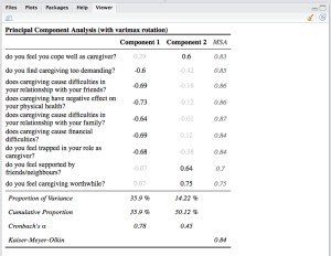
Two more new functions are sjt.pca for printing results of principal component analyses and sjt.corr for printing correlations. Printing PCA results will give you an overview of all extracted factors, where the highest factor loading is printed in black, while the other factor loadings are a bit faded (thus, it’s easier to see which item belongs to which factor). Furthermore, you can print the MSA for each item, the Cronbach’s Alpha value for each “scale” and other statistics:

data(efc)
# retrieve variable and value labels
varlabs <- sji.getVariableLabels(efc)
# recveive first item of COPE-index scale
start <- which(colnames(efc)=="c82cop1")
# recveive last item of COPE-index scale
end <- which(colnames(efc)=="c90cop9")
# create data frame with COPE-index scale
df <- as.data.frame(efc[,c(start:end)])
colnames(df) <- varlabs[c(start:end)]
sjt.pca(df, showMSA=TRUE, showVariance=TRUE)

sjtpca_1

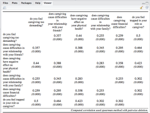
The next example is a correlation table. Note: This table may look more beautiful if opened in a web browser (because of more space). And second note: See the usage of the CSS-parameter! (more on this later)

sjt.corr(df, pvaluesAsNumbers=TRUE, 
CSS=list(css.thead="border-top:double black; font-weight:normal; font-size:0.9em;",
         css.firsttablecol="font-weight:normal; font-size:0.9em;"))

sjtcorr_1

Stacked frequencies and Likert scales

The last new table-output-function is sjt.stackfrq, which prints stacked frequencies of (Likert) scales.

data(efc)
# recveive first item of COPE-index scale
start <- which(colnames(efc)=="c82cop1")
# recveive first item of COPE-index scale
end <- which(colnames(efc)=="c90cop9")
# retrieve variable and value labels
varlabs <- sji.getVariableLabels(efc)
vallabs <- sji.getValueLabels(efc)
sjt.stackfrq(efc[,c(start:end)],
             valuelabels=vallabs['c82cop1'],
             varlabels=varlabs[c(start:end)],
             alternateRowColors=TRUE)

sjtstackfrq_1
Similar to the sjp.stackfrq function (see this posting), you can order the items according to their lowest / highest first value etc.

Tweaking the table-output-functions and integrating output into knitr

In this section, important new parameters of the table-output-functions are described.

Each sjt function as well as sji.viewSPSS now have following parameters:

  • CSS
  • useViewer
  • no.output

And all of them (invisibly) return at least following values:

  • the web page style sheet (page.style),
  • the web page content (page.content),
  • the complete html-output (output.complete) and
  • the html-table with inline-css for use with knitr (knitr)

Parameters explained

CSS
The table-output is in HTML format, using cascading style sheets to modify the appearance of tables. You can inspect the page.style and page.content parameters to see which CSS classes are used in the HTML-table, for instance:

> value <- sjt.df(efc)
> value$page.style
[1] "<style>\ntable { border-collapse:collapse; border:none; }\ncaption { font-weight: bold; text-align:left; }\n.thead { border-top: double; text-align:center; font-style:italic; font-weight:normal; padding:0.2cm; }\n.tdata { padding:0.2cm; text-align:left; vertical-align:top; }\n.arc { background-color:#eaeaea; }\n.lasttablerow { border-top:1px solid; border-bottom: double; }\n.firsttablerow { border-bottom:1px solid; }\n.leftalign { text-align:left; }\n.centertalign { text-align:center; }\n.firsttablecol {  }\n.comment { font-style:italic; border-top:double black; text-align:right; }\n</style>"

To use the CSS parameter, you must define a list with values, where the value-name equals the css-class-name with css. prefix. If you want to change the appearance of the first table column (with variable names), use:

sjt.df(efc, CSS=list(css.firsttablecol="color:blue;font-style:italic;"))

Refer to the function-help to see more examples…

useViewer and no.output
With useViewer set to FALSE, you can simply force opening the html-table-output in a web browser, even if a viewer is available. With no.output set to TRUE, you can suppress the table output completely. This is useful if you want to integrate the tables in your knitr-documents…

Knitr integration

As said above, each sjt-function returns an object where you can access the created html-output. The $knitr object contains the pure html-table (without HTML-pageheader or body-tags) with inline CSS (thus, no class-attributes are used). This allows the simple integration into knitr-documents. Use following code snippet in your knitr-documents and knit it to HTML:

`r sjt.df(efc, no.output=TRUE)$knitr`

Office import improvements

When setting the file parameter, the table-ouput is saved to a file. This can be opened via MS Word, LibreOffice Writer etc. The import has been improved, so the imported table should render properly now.

Last Words…
Well, enough said. ;-) All feature available in the latest sjPlot-package.


Tagged: data visualization, R, rstats, SPSS, Statistik

Developer snapshots of #sjPlot-package now on #Github #rstats

$
0
0

Finally, I managed to setup a GitHub repository. From now on, the latest developer snapshot of my sjPlot-package will be published right here: https://github.com/sjPlot/devel.

Please post issues there, download the latest developer build for testing purposes or help developing the wiki-page with examples for package usage etc.

Btw, if somebody knows, why I can’t get GitHub running with RStudio, let me know… I always get this issue, which was already reported by other users. Currently, I’m using the GitHub.app to commit changes.


Tagged: github, Open Source, R, rstats

Organizational Behaviour im Kooperationsnetzwerk

$
0
0

eine systemtheoretisch-qualitative Analyse von Kooperationsnetzwerken unter den Bedingungen polykontexturaler Verhältnisse

Das ist das Thema meines Beitrags zum frisch bewilligten DFG-Netzwerkantrag Organizational Behaviour in health care institutions in Germany – theoretical approaches, methods and empirical results im Rahmen der DGMS-AG-Versorgungsforschung.

Einleitung: Im Kontext der vernetzten Versorgung wird von den Beteiligten (Krankenhäuser, Pflegedienste, Ärzte etc.) eine optimale Koordination und Kooperation in der Überleitung und der anschließenden Weiterversorgung von chronisch Erkrankten und Pflegebedürftigen gefordert. Allein wegen der immer kürzer werden Liegezeiten von Patienten ist eine netzwerkförmige Kooperation notwendig, um Zuständigkeiten der Versorgung immer wieder neu auszuhandeln und zuzuweisen (Saake und Vogd 2008; W. Vogd 2009a).
Für die vernetzten Organisationen heißt das, dass Schnittstellen nicht mehr als Einrichtungen zur automatischen Sicherstellung von Kooperation gesehen werden können, sondern mit Bezug auf aktuelle soziologische System- und Netzwerktheorien als rationalitäts- und transparenzpessimistisch aufgefasst werden müssen (Luhmann 2000; Baecker 2007; Baecker 2011; Blaschke u. a. 2012).

Fragestellung Wie agieren Organisationen im Kooperationsnetzwerk unter Berücksichtigung von Eigeninteressen und unerwartetem Verhalten der beteiligten Akteure?

Theoretischer Rahmen Organisationen sind komplexe Systeme, in denen weniger rationale Entscheidungen und Handlungen, sondern eher ihr Gegenteil anzutreffen ist (Besl 2011). Angesichts verschiedenster (Umwelt-)Anforderungen agieren sie nach einer Logik, die für außen stehende Beobachter häufig irrational und unlogisch erscheint (Brunsson 1985). Um den „Prozess des Organisierens“ (Weick 1998) zu verstehen, soll unter Rückgriff auf die Organisations- und Systemtheorie Luhmanns (Luhmann 1984; Luhmann 2000) versucht werden, die unterschiedlichen Handlungslogiken in Organisationen zu rekonstruieren.

Methode Es wurden 17 Experten aus verschiedenen Krankenhäusern der Akut- und Allgemeinversorgung in Form qualitativer, leitfadengestützter Interviews befragt. Diese werden mit Hilfe der dokumentarischen Methode (Bohnsack 2007a) ausgewertet. Als rekonstruktives Verfahren liegt der Auswertungsschwerpunkt auf der Beschreibung des Prinzips der Selbstorganisation eines Untersuchungsgegenstandes aus der Eigenlogik des untersuchten Gegenstandes heraus (Bohnsack 2007b; Vogd 2009b). Im Fokus stehen weniger einzelne Akteure als vielmehr der Prozess des Organisierens selbst.

Zu erwartende Ergebnisse und Diskussion Es soll eine Typologie entwickelt werden, die Aufschluss über das Verhalten von Organisationen in Kooperationsnetzwerken gibt. Auszugehen ist von einer „professionellen Selbststeuerung“, die organisationales Verhalten nur schwer vorhersehbar macht und die Entscheidungslogiken nur unter Berücksichtigung polykontexturaler Verhältnisse (Günther 1979) verständlich werden lässt. Organisationen sind immer wieder auf netzwerkförmige Aushandlungsprozesse zur Herstellung von Stabilität angewiesen.


Tagged: Forschungsmethoden, Luhmann, Netzwerk, Organisation, Polykontexturalität, Schnittstellen, Systemtheorie, Versorgungsforschung

sjPlot: New options for creating beautiful tables, documentation on #RPubs #rstats

$
0
0

A new update of my sjPlot package was just released on CRAN. This release focused on improving existing functions and bug fixes again. Especially the table output functions (see my previous blog posts on table output functions here and here) improved a lot. Tables now have more and better possibilities for style customization and knitr integration. A basic introduction into the new features is given in this RPubs document.

To make it easier to understand all features, I started to setup comprehensive documentations for all sjPlot functions on RPubs. Below you find a list of currently available documents.

RPubs documentation

sjPlot basics

Plotting functions

Table functions


Tagged: data visualization, R, rstats, sjPlot

Visualize pre-post comparison of intervention #rstats

$
0
0

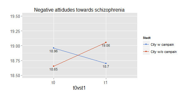
My sjPlot-package was just updated on CRAN, introducing a new function called sjp.emm.int to plot estimated marginal means (least-squares means) of linear models with interaction terms. Or: plotting adjusted means of an ANCOVA.

The idea to this function came up when we wanted to analyze the effect of an intervention (an educational programme on knowledge about mental disorders and associated stigma) between two groups: a “treatmeant” group (city) where a campaign on mental disorders was conducted and another city without this campaign. People from both cities were asked about their attitudes and knowledge about specific mental disorders at t0 before the campaign started in the one city. Some month later (t1), again people from both cities were asked the same questions. The intention was to see a) whether there were differences in knowledge and pro-social attidutes of people towards mental disorders and b) if the compaign successfully reduces stigma and increases knowledge.

To analyse these questions, we used an ANCOVA with knowledge and stigma score as dependent variables, “city” and “time” (t0 versus t1) as predictors and adjusted for covariates like age, sex, education etc. The estimated marginal means (or least-squares means) show you the differences of the dependent variable.

Here’s an example plot, quickly done with the sjp.emm.int function:
sjpemmint

Since the data is not publicly available, I’ve set an an RPubs-documentation with reproducable examples (though those example do not fit very well…).

The latest development snapshot of my package is available on GitHub.

BTW: You may have noticed that this function is quite similar to the sjp.lm.int function for visually interpreting interaction terms in linear models…


Tagged: ANCOVA, data visualization, ggplot, R, rstats, sjPlot, Statistik

sjPlot 1.6 – major revisions, anyone for beta testing? #rstats

$
0
0

In the last couple of weeks I have rewritten some core parts of my sjPlot-package and also revised the package- and online documentation.

Most notably are the changes that affect theming and appearance of plots and figures. There’s a new function called sjp.setTheme which now sets theme-options for all sjp-functions, which means

  1. you only need to specify theme / appearance option once and no longer need to repeat these parameter for each sjp-function call you make
  2. due to this change, all sjp-functions have much less parameters, making the functions and documentation clearer

Furthermore, due to some problems with connecting / updating to the RPubs server, I decided to upload my online documentation for the package to my own site. You will now find the latest, comprehensive documentation and examples for various functions of the sjPlot package at www.strengejacke.de/sjPlot/. For instance, take a look at customizing plot appearance and see how the new theming feature of the package allows both easier customization of plots as well as better integration of theming packages like ggthemr or ggthemes.

Updating the sjPlot package to CRAN is planned soon, however, I kindly ask you to test the current development snapshot, which is hosted on GitHub. You can easily install the package from there using the devtools-package (devtools::install_github("devel", "sjPlot")). The current snapshot is (very) stable and I appreciate any feedbacks or bug reports (if possible, use the issue tracker from GitHub).

The current change log with all new function, changes and bug fixes can also be found on GitHub.


Tagged: data visualization, Open Source, R, rstats, sjPlot

Visualizing (generalized) linear mixed effects models with ggplot #rstats #lme4

$
0
0

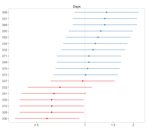
In the past week, colleagues of mine and me started using the lme4-package to compute multi level models. This inspired me doing two new functions for visualizing random effects (as retrieved by ranef()) and fixed effects (as retrieved by fixef()) of (generalized) linear mixed effect models.

The upcoming version of my sjPlot package will contain two new functions to plot fitted lmer and glmer models from the lme4 package: sjp.lmer and sjp.glmer (not that surprising function names). Since I’m new to mixed effects models, I would appreciate any suggestions on how to improve the functions, which results are important to report (plot) and so on. Furthermore, I’m not sure whether my approach of computing confident intervals for random effects is the best?

I have used following code to compute confident intervals for the estimates returned by the lme4::ranef() function (bases on this stackoverflow answer):

coev <- as.matrix(lme4::vcov.merMod(fit))
tmp <- as.data.frame(cbind(OR = exp(mydf.ef[,i]),
                     lower.CI = exp(mydf.ef[,i] - (1.96 * sqrt(diag(coev))[i])),
                     upper.CI = exp(mydf.ef[,i] + (1.96 * sqrt(diag(coev))[i]))))

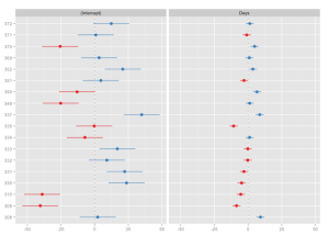
The update to version 1.6 of sjPlot is still in development (feature-freeze, mostly fixes now), however, you can download the latest snapshot from GitHub (see also this post for further information). Now to some examples. First, an example model is fitted and the random effects (default) for each predictor are plotted as “forest plot”:

# fit model
library(lme4)
fit <- lmer(Reaction ~ Days + (Days | Subject), sleepstudy)
# simple plot
sjp.lmer(fit)

lmer1

Sorting a predictor (i.e. estimates of a facet) is done by specifying the predictor’s name as sort parameter.

sjp.lmer(fit, sort = "Days")

lmer2

Each facet plot can also be plotted as single plot, when facet.grid is set to FALSE. In this case, it is possible to sort the estimates for each plots. See following example from the sjp.glmer function:

library(lme4)
# create binary response
sleepstudy$Reaction.dicho <- sju.dicho(sleepstudy$Reaction, 
                                       dichBy = "md")
# fit model
fit <- glmer(Reaction.dicho ~ Days + (Days | Subject),
             sleepstudy,
             family = binomial("logit"))
sjp.setTheme(theme = "forest")
sjp.glmer(fit, 
          facet.grid = FALSE, 
          sort = "sort.all")

glmer1 glmer2

Plotting the fixed effects is not much spectacular, because we only have one estimate beside intercept here.

sjp.glmer(fit, 
          type = "fe", 
          sort = TRUE)

glmer3

To summarize, you can plot random and fixed effects in the way as shown above. Are there any other or better plot options for visualizing mixed effects models?

Any suggestions are welcome…

Disclaimer: all misspellings belong to Safari’s autocorrect feature!


Tagged: data visualization, ggplot2, lme4, R, rstats
Viewing all 72 articles
Browse latest View live